CityPups Case Study:
CityPups is a new startup that wants to help people living in cities find the perfect dog to adopt.
Scroll ↓
Overview
This case study is for a Google Ventures design sprint project, modified to be completed by one person. The project is to complete an MVP (minimum viable product) for an adoption website that strives to match those who live in large cities with the perfect dog for them.
The Challenge
There lies a unique set of challenges that citydwellers face when it comes to adopting a dog. The potential dog owner must consider how the dog will adapt to the owner’s small living spaces, limited outdoor space, lengthy workdays, and public transportation.
The Solution
CityPup’s goal is to create an adoption process catered to those who live in densely populated cities. CityPup will accomplish this goal by presenting meaningful information to the aspiring dog owner and by offering the ability to connect with the adoption center.
My Role
I completed the sprint for my Springboard UX/UI Design course. My job was to analyze the already-included user interviews and personas, map out a user flow, design the interface, and test the design with users.
The Process
Day 1: Understand & Map - read through research, map out user flow
Day 2: Sketch - spend time creating competitive analysis and sketching screens for CityPups interface
Day 3: Decide - build a storyboard
Day 4: Prototype - build a prototype
Day 5: Validate - usability testing
Day 1:
User Data
CityPups provided user interviews and personas. I analyzed this information in order to better understand the users’ goals, motivations and pain points.
CityPup interviewed 10 potential dog owners. Of those interviewed, top concerns while searching for a dog included
clear photos / videos
whether the potential dog owner had enough space for the dog
whether the dog was good in public/around other dogs
Persona
I was introduced to Ellie (via a pre-recorded interview), a 27-year-old who resides in an NYC studio apartment.
follows some adoption agencies on Instagram and “saves” the profiles of dogs she wants to adopt.
messages adoption agency representatives to ask questions but can be time consuming to find the right contact or to make an appointment
Key Insights
In order to comfortably start the adoption process, a user must feel properly informed. In order to feel properly informed, the user must be presented with -
Clear photos or videos of the dog
Basic info for the dog - size and age
The dog’s needs - including desired amount of space, attention
Ability to communicate with adoption center
Ability to revisit dogs’ profiles
Map
After analyzing the information, I found it important to ask users relevant information upon registration, the ability to save dogs’ profiles, and a way to message the adoption center within the app. Then, I created a map with a user’s possible end-to-end experience.
Day 2:
Gathering Information
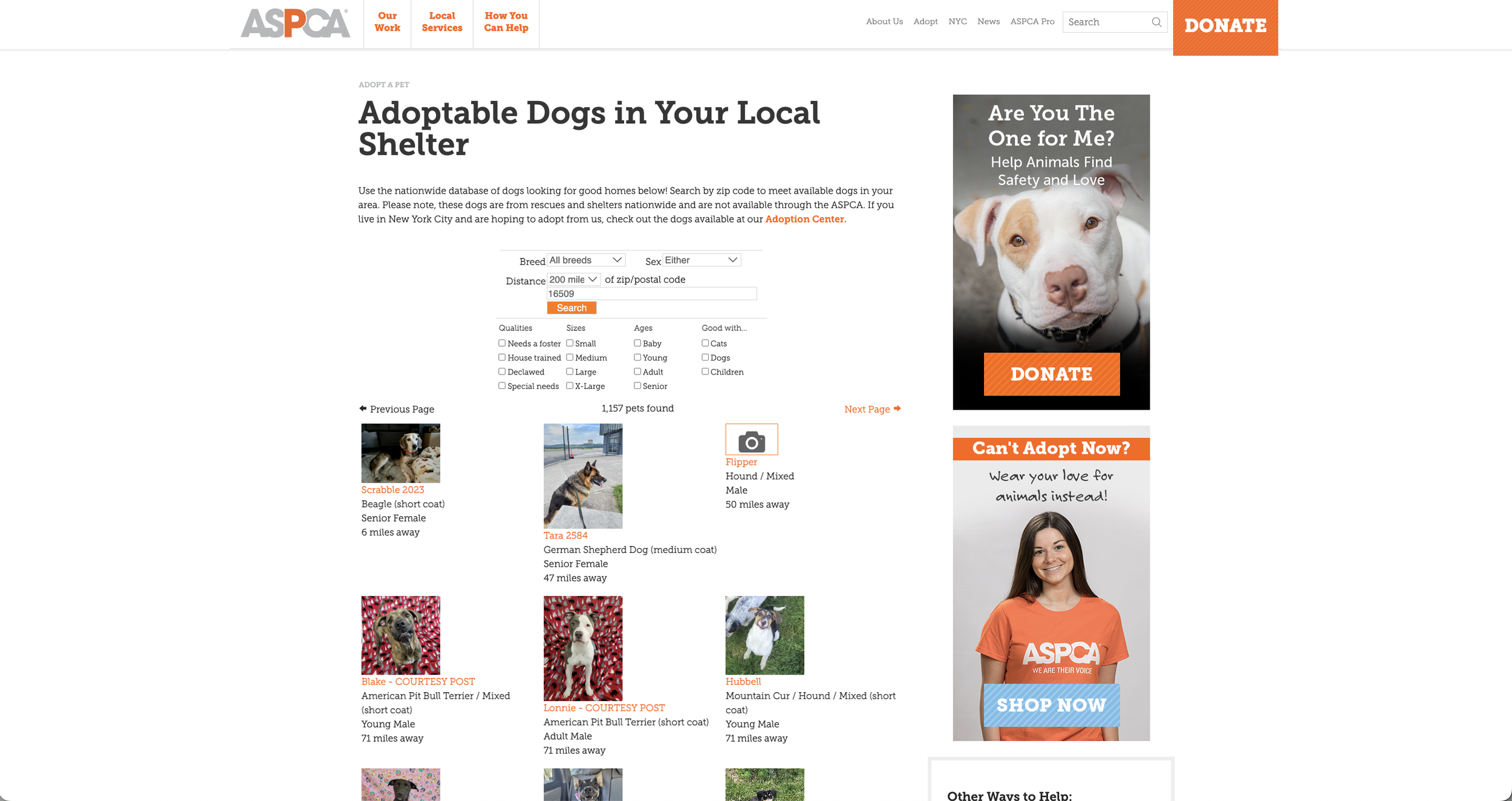
I have selected three dog adoption websites that are local to me. Each website displays the dog's name, with a photo of the dog. This confirms that names and photos are imperative to include in my own design for the CityPup website. On the thumbnails of the dogs, two websites included basic information, such as gender, age and breed - which I found useful.
Sketching: Crazy 8s Method
I used the Crazy 8s sketching method, to quickly draw 8 screens that should be present on the website. I was only allowed 8 minutes to complete this exercise.
Sketching: Solution Sketch
From the series of 8 screens I sketched, I drew the solution sketch based on the dog’s profile page, along with one screen that will exist before it and one screen that will exist after it.
For the solution sketch, my most critical screen is the profile for the adoptable dog. This will display critical information to the user - like how much activity and space the dog needs, where the dog is located, and importantly - a call to action button to apply to adopt the dog. Another important feature on this screen is a carousel of photos and videos of the dog, so users can better see the size and energy level of the dog.
Day 3:
Decide
Currently, competing websites do not display the information important to the future dog owners who live in the city. In order to solve these frustrations, it is imperative that the app offers relevant information that the user can find quickly and easily. It is also helpful that the user registers with their own relevant information so the app can display dogs that are best matching with the aspiring dog owner.
Storyboard
I sketched out a critical flow of the app - starting with the registration page that asks the user for relevant information, the home page the user is then taken to that shows users the dogs that matched their needs, then a dog’s individual profile page, where you have the ability to message the shelter.
Day 4:
Protoptype
The prototype for the CityPup design is 5 desktop screens using various shades of blue. I included the critical screen of the dog's profile page, along with a few pages before it and a few pages after it. The goal for creating my prototype is so I can test the design with my target user base. I want to see if the designs are impactful and resonate with the users, and also make sure that the UI is intuitive. I hope to uncover any elements of the design that are not intuitive so I can amend them in order to create a better user experience.
Registration Page
I created a registration page asking the user for information so the app can generate relevant dog matches.
Adoption Page
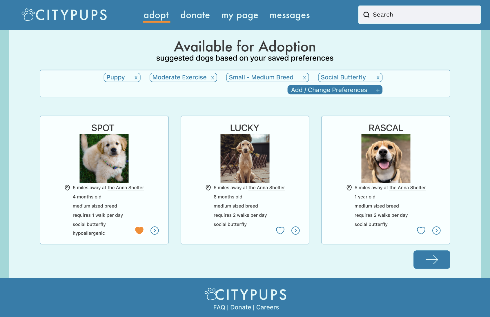
The adoption page acts as a user’s feed. Here, a user is presented with dogs that match the criteria they had entered during the registration process. There are cards with the dog’s name, photo, current distance from user as well as size, how much activity they require, and how social they are.
Dog’s Profile Page
The dog’s profile page features more photos or videos, as well as a bio. Here, a user has the ability to either message the shelter or apply for adoption.
Day 5:
Validate - Usability Testing
To validate my design, I conducted 5 moderated in-person tests with dog owners who live in the city of Erie, Pennsylvania. The participants were asked to walk through the prototype on Figma. The tasks I asked the participants to complete included
Register for a new account
How would you search for a specific dog?
Change dog preferences
Message adoption agency
Apply for adoption
After asking the participants to complete the tasks, I was sure to ask for any additional feedback - was the site easy to navigate? Was the text clear and easy to read?
Testing Takeaways
Testing Takeaways:
The participants successfully completed the tasks presented to them.
One point of confusion was the arrow underneath the list of suggested dogs - would it take you to the next page of suggested dogs? Or would it take you to an entirely different page for messaging or an adoption application?
Users’ suggestions -
Including adoption fee in dog’s thumbnail, before getting to their specific page
Adding a preferred breed as a category upon registration
Next Steps
I will be sure to take the usability test results into consideration when amending my design. In order to offer a better experience for users, I plan on
Adding breed preference to list of registration questions
Labeling the “next page” arrow on the screen with the suggested dogs


