Fit Friends Case Study:
FitFriends: A workout app to help users stay motivated by keeping users connected with their friends
September 2023
scroll
Overview:
This case study is for a research and design project in which a well-established company wants to add new messaging features that creates repeat usage and sustained engagement to a health tracking app that values sharing fitness goals and successes with family and friends.
The Challenge:
On average, a user will download the app and use it frequently for three weeks but usage will drop off shortly after the three week mark, and soon after that - users delete the app.
The Solution:
FitFriends’ goal is to design new messaging features that create sustained engagement. FitFriends will accomplish this goal by creating the opportunity for users to message each other with health and fitness goals/achievements, as well as create an integrated messaging experience throughout the product that drives engagement and repeat usage.
My Role:
I completed this project for my Springboard UX/UI Design course. I was given the design prompt to design an interface that would give users the ability to message each other with health and fitness goals/achievements. Springboard provided the prompt and target user.
The Process:
Empathize - competitive analysis, user survey, secondary research
Define - persona
Ideate - user flow
Prototype - low-fidelity wireframes, style guide, high-fidelity prototype
Test - conduct usability tests
Define
Persona
Springboard supplied the traits for our target user -
● 18 - 34 years old
● Very tech-savvy — they are on their phones for several hours a day
● Very budget-conscious
● Messaging and communicating with friends and family is a very important part of their daily lives
Empathize
Competitive Analysis
I took time to look at other fitness tracking applications to see what worked well within the interfaces.
Productive Habit Tracker - This app has no messaging features, however the UI is very intuitive, they feature “streak” pop-ups that create positive reinforcement to continue using the app, article highlights, easy-to-read progress bar and positive copy.
FitList - Gym Workout Log - This app does not have a messaging feature, however it does offer the ability to comment and like other user’s posts or status updates, which is typically when the user logs a completed activity. The app also has a very intuitive UI. There are no suggested friends, so users must search for a specific username to find a friend.
Map My Run by Under Armour - This app does not have a messaging feature. There are no suggested friends - so users must input either a user’s full name or email address to be found.
Overall, qualities consistent with these 3 apps are the fact that they exhibit positive copy, bold colors and a clean, focused interface.
Primary Research: User Survey
When participants were surveyed whether they currently use their fitness app to communicate health and fitness related goals and tasks to friends and family, 9 of 9 participants said they did not. I conducted this survey with an anonymous Google survey.
The age of participants ranged from 26 - 42, and on average, work out 3-4 times per week.
Secondary Research
Contrary to my primary research, my secondary research proves that a well-designed app that sends users personalized fitness reminders encourages consistency (UCLAHealth, Are fitness trackers enough to keep you motivated and turn exercise into a habit? 2022).
Corporate Wellness Magazine says that apps that include a method to communicate with friends, family and other users creates a sense of community “that can help users stay on track with their fitness goals” (Corporate Wellness Magazine, The benefits of fitness apps: How they can improve employee well-being and mental health).
This research proves that an app should feature a method of communication among users, as well as positive support by way of messaging users - to remind them of goals, as well as congratulating them on consistent app usage or meeting their goals.
Through my secondary research, it was proven that fitness tracking apps that foster a sense of community through a messaging feature experience
fewer dropoff rates
increased & consistent usage by the user.
Another point my research had made was that when apps sent the user daily customized messages, the user made greater strides in meeting their health and fitness goals.
My primary research proves that most of those interviewed strictly use their fitness apps for tracking, rather than communicating.
My secondary research makes me optimistic that properly executing a good user experience that benefits the user will contribute to higher app retention rates.
Ideate
User Flow
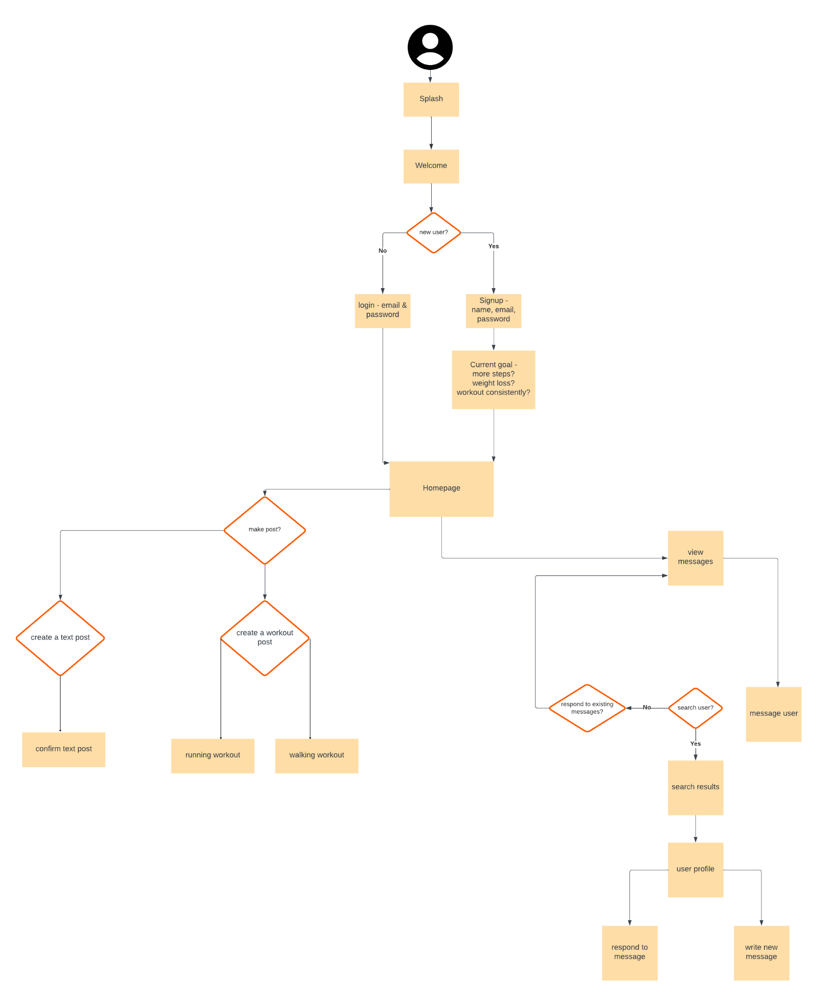
I created a user flow showcasing the red routes, or critical paths, a user would take to complete a task. The goal of FitFriends was to integrate a messaging feature, and provide a way of sharing accomplishments with friends. The two red routes I chose to showcase in the user flow are
Red Route 1: Create a Fitness Post
Red Route 2: Message a friend
Prototype
Low-Fidelity Wireframes
From the user flow, I designed low-fidelity wireframes to lay out how I wanted the app structured. I used shades of gray rather than any color in order to provide more focus on the features, rather than the style.
Style Guide
Once I finished the wireframes, I moved on to creating a style guide for the app to reference for consistent design of my high-fidelity wireframes.
High-Fidelity Prototype
After finishing the style guide, I designed high-fidelity wireframes and a prototype to incorporate styling in the app.
Iteration of High-Fidelity Wireframes
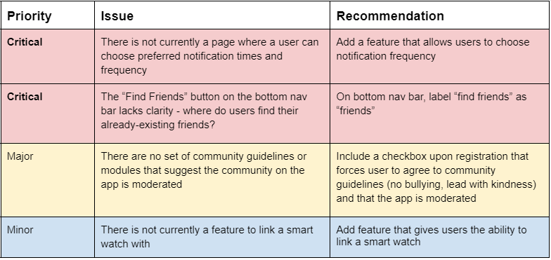
Upon completion of my high-fidelity wireframes, I gave 5 potential users a usability test and used their feedback to make improvements to the app.
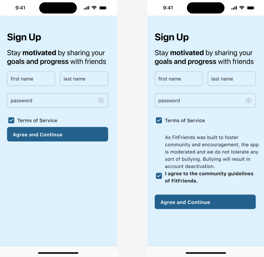
Added a community guidelines agreement on the registration screen
Added a notifications page along with notifications settings
Changed the “find friends” text on the bottom navigation bar to “friends” - an easier way to find the users you are already friends with.
Test
Usability Test on Low-Fidelity Wireframes
I conducted usability tests on my low-fidelity wireframes with 5 participants who would likely use the app. I received valuable feedback that I organized by how critical any issues were so I could implement changes when designing the high-fidelity prototype.
The tasks I had the participants complete were
Create a Fitness Post
Message a Friend
Testing Takeaways:
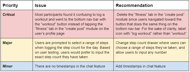
Participants had trouble completing the first red route due to poor design of the “create post” module on the user’s profile page
Most participants had difficulty logging a workout. My intentions were for users to easily add a post by toggling to the “fitness” tab in the “create post” module on the user’s home screen
Two participants said they’d rather log a specific amount of steps, rather than log a range of steps when logging how many they’ve walked for the day
Usability Test on High-Fidelity Prototype
I decided to change the red routes after the feedback I received from the first round of usability testing. Participants were naturally choosing the “workout” button at the bottom nav bar to log a workout, so I decided to delete the option of adding a workout post on the user’s profile page in the “add post” module.
I changed the red route to register for an account, and log your first workout. It was clear that asking participants to complete that task on the updated screens was a lot less confusing than it previously was.
Updated Red Routes:
Register for an account and log your first workout
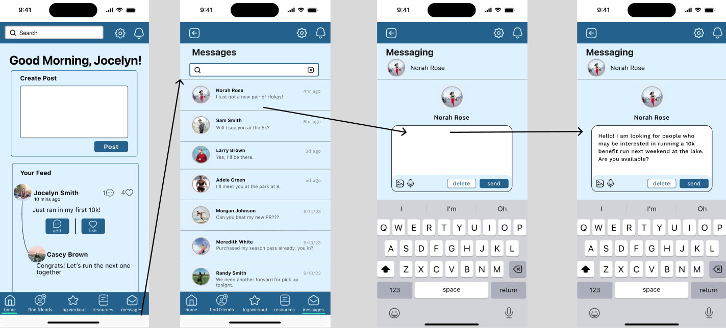
Message Norah from your friends list
Testing Takeaways:
All participants were able to complete the tasks at hand
Choosing notification times would offer further personalization and customization of the app, an option favored by participants
Offering a “community” area on the app would be beneficial for retention
Next Steps
I plan on continuing to user test and iterate on my design to offer a great user experience that will boost retention rates for the app.
Specific steps I plan on taking include -
Build the “community” feature
Design smart watch integration
Build out notification settings to specify type of workout notifications - should we alert with current step count if a goal is met when we integrate with smart watch capability?
I look forward to implementing the changes mentioned to offer a stronger user experience and app retention on the FitFriends app.


